This site
Two content collections, a design system in one file, and a publishing loop that ends here.
27 Aug 2026
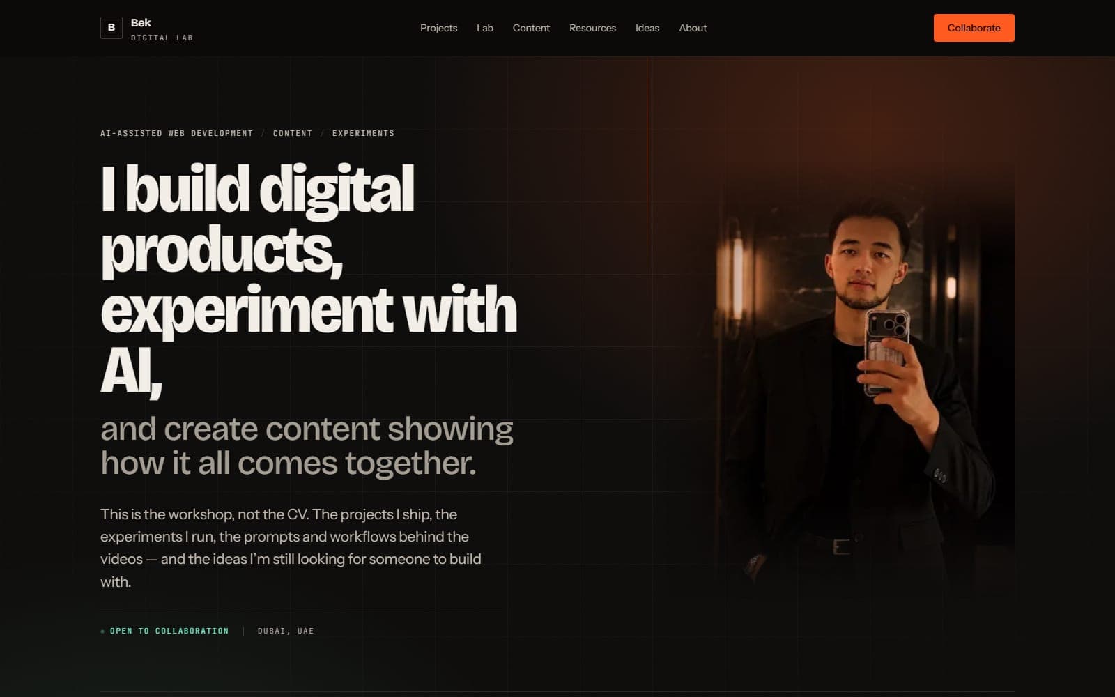
The site you are reading. I am including it because the interesting part is not that it exists, it is what had to be decided before a single component got written.
Built human-led and AI-assisted: I set the brief, made the design and architecture decisions, ran the reviews and the testing, and held the quality bar. AI tools carried a large share of the implementation. The decisions below are the part that mattered.
The actual problem
A portfolio is easy. This is not a portfolio. It has to serve three people who want completely different things:
- someone who might hire me, who wants proof I can build
- someone who might build something with me, who wants to know how I think
- someone who just watched a sixty-second video and wants the prompt
Those pull in opposite directions. Optimise for the first and you get an agency site. Optimise for the third and you get a link dump. The compromise most personal sites reach is a homepage with one call to action that suits exactly one of them.
The decision that shaped everything else
The homepage has one primary CTA, See what I've built, under a three-beat headline. Below that, four short sections do the self-selection: what I've built, what the videos leave out, what's in my toolkit, and who is behind it. Any of them can be the route a visitor takes.
The earlier version tried a four-route rail as the primary interaction. It looked democratic and read as indecision. One clear invitation, then real work under it, does the same job without asking the visitor to choose their own adventure at the door.
Content architecture
Two MDX collections and one flat listing:
| Collection | What goes in it |
|---|---|
projects | Things I built, with the reasoning |
content | The full version behind a video or post |
tools | The stack. A short list of what I actually use, from a data file, not MDX. |
Adding to a collection means adding one file. No CMS, no database, no admin panel. Tags
link entries across collections, so a project tagged nextjs automatically surfaces a
content entry tagged nextjs in its related rail. The site cross-links itself as it
grows.
Every route is prerendered at build time.
An earlier version had five collections, projects, lab, content, resources, ideas,
each with its own accent colour and section identity. It read as busier than it was.
Merging the experimental and reference material into projects (with honest status
tags on each entry) let the copy stay specific without asking the reader to hold five
category names in their head. Old URLs 308-redirect to the new locations, so nothing
already shared or indexed broke.
Design system
Warm near-black paired with a warm cream, not the blue-black that every AI product landing page uses. One accent, brass, the tungsten lamp already present in the photography, which is why it reads correctly on both grounds. Earlier drafts had three accents doing three jobs (one hot for energy, one cool for state, one warm for reference). The visible payoff wasn't worth the mental cost of remembering which section "belonged" to which colour, so the palette collapsed to one and sections announce themselves by which room they are in, daylight or night, instead.
The whole system is one CSS file. Colour, type scale, spacing, easing curves, durations. Changing the brand means changing that block.
Three bugs the review caught
Content stranded invisible. Scroll reveals started at opacity: 0 and were revealed
by an IntersectionObserver. In a backgrounded tab the observer never fires, so the page
loaded and stayed blank. Now the entry styles only apply inside
@media (scripting: enabled), with a 2.5 second failsafe timer behind that. Motion is a
nicety; the content is not.
The mobile menu collapsed to nothing. The header had backdrop-blur, which quietly
makes an element a containing block for position: fixed children. The full-screen panel
inside it was being sized against a 72px header. It computed to 0.63 pixels tall.
Missing decorative utilities. Every index-page masthead and no-cover card referenced
.bench-grid, .work-light, and .grain classes that were never defined in
globals.css. Mastheads rendered as flat paper for weeks, the code was asking for a lit
workshop surface and getting nothing back. Restored as a single block of CSS, no code
elsewhere needed to change.
What I would change
The content collection is set up to carry write-ups behind every video I post. Two
entries live so far. The section will earn its top-level nav slot when there are ten.
I also want a real second accent back, a cool tone, held for live states and focus rings only, because "brass and only brass" is honest but flattens one distinct signal (this thing is happening now) into the same colour as this thing is a link. Track C of the current improvement plan reintroduces it.
How I actually build with Claude Code
The working loop. Project context, questions before code, and small slices verified in the browser.
Read ProjectsShot Planning Toolkit
A pacing guide, a storyboard and a briefing. Enough to run a shoot with a first-timer.
Read ProjectsThe prompt system I use to build client websites
Two documents instead of one prompt. A permanent quality standard, and a per-client brief.
ReadNeed something built along these lines?