Ember & Olive
A cinematic site for a Mediterranean restaurant, built to re-skin for real hospitality clients.
18 Jun 2026
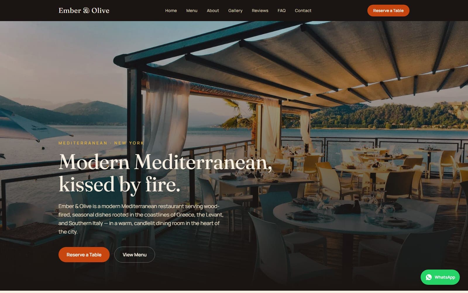
Restaurant websites tend to fail in the same two ways: they either look like a printed menu someone scanned in 2011, or they look expensive and make it impossible to find the opening hours. Ember & Olive was an attempt to get the atmosphere of the first kind of site and the usefulness of the second.
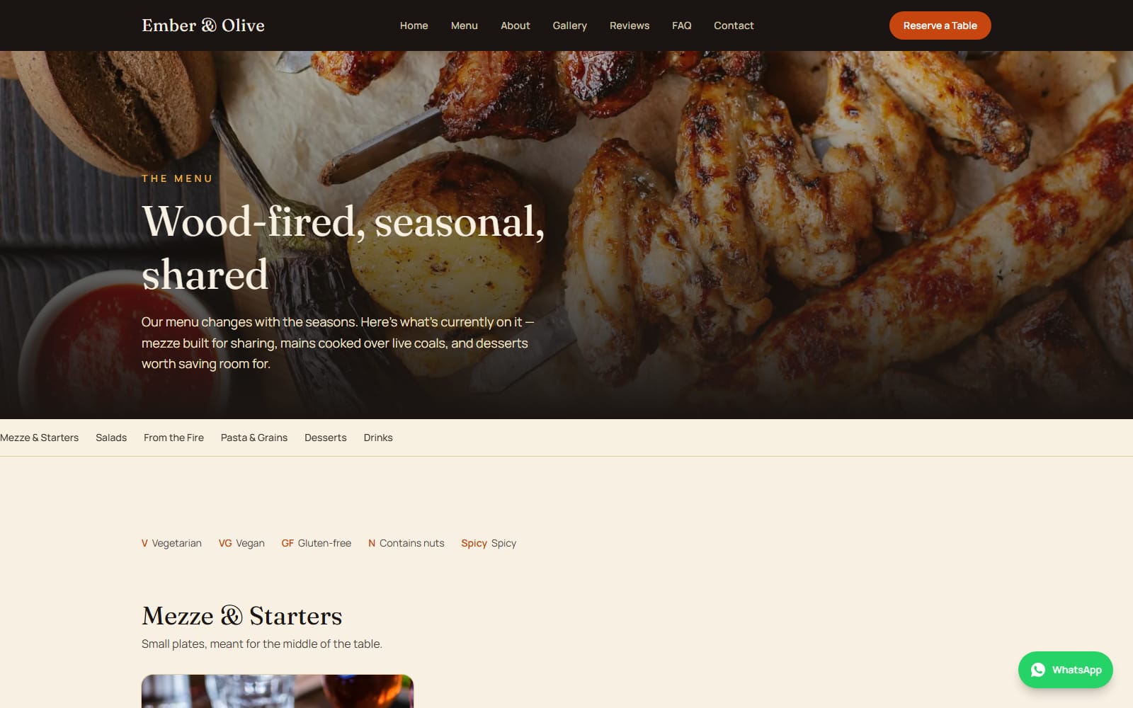
The brief I set myself
Build a restaurant site good enough to hand to a paying client, then make it re-skinnable so the next restaurant takes days instead of weeks. Two goals that pull against each other, bespoke design work resists templating, and templates resist feeling bespoke.
How it is put together
Everything that makes a restaurant that restaurant lives in a handful of typed data files rather than being scattered through components:
| What changes per client | Where it lives |
|---|---|
| Name, contact, address, socials | src/data/siteConfig.ts |
| Opening hours | src/data/hours.ts |
| Menu items and categories | src/data/menu.ts |
| Gallery, reviews, FAQ | src/data/*.ts |
| Colour system | CSS variables in globals.css |
| Fonts | One import in layout.tsx |
Swapping those files plus the photography produces a genuinely different-looking site without touching a single component. The design system is the reusable part; the composition is not.
The reservation problem
There is no backend in v1, and I did not want to fake one. A form that silently does nothing is worse than no form.
So the reservation flow validates client-side with react-hook-form and zod, then
opens WhatsApp with the booking details pre-filled, the guest reads the message and
sends it themselves. The restaurant gets the booking in the place they already check.
The general enquiry form does the same thing through mailto:.
It is not clever. It works with zero infrastructure, and both forms can be swapped for a real API route or a booking platform later without changing the components.
What I would change
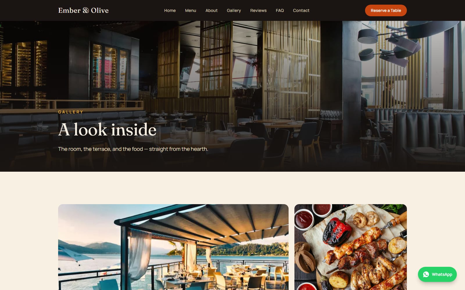
The photography is Unsplash placeholder work, and it shows, the layout is built for real food photography with a consistent grain and colour temperature, and stock images never quite hold that together. The first real client version of this will look noticeably better for that reason alone.
I would also revisit the menu page. It works, but it is the most conventional part of the site, and it is the page people actually spend time on.
This site
Two content collections, a design system in one file, and a publishing loop that ends here.
Read ProjectsDonaza
An Uzbek restaurant site for Dubai, assembled on Base44 to test how far AI builders get.
Read ProjectsBeki Uzbek Cuisine
A storytelling site for an Uzbek restaurant, built around the shared table rather than a menu grid.
ReadNeed something built along these lines?